Milwaukee Flag Design
|
Title:Milwaukee Flag
Size:28cmx20.3cm Medium:Colored Pencil Completed:November Intentions:With this piece I wanted to apply my knowledge of Milwaukee's past and present to create a flag design. I wanted this design to be simple enough that a child could recreate it, but also complex enough that the audience had to think about its deeper meaning. I focused on Milwaukee's industrial period, wheat production, and Lake Michigan. Made or Found:Made |

|
Artist & Culture
|
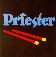
I was inspired by the graphic designer Lucian Bernhard. He had simplistic designs that appealed to a wide audience. Examining Bernhard's pieces assisted me in creating a flag design that was not too complex, like Milwaukee's current flag, but also a flag that was not too simplistic.. He won the German poster competition for the Priester Match Company, which is another reason why I considered him a good artist to use as a reference. I explored the culture of Milwaukee, Milwaukee's history, to determine what my flag would symbolize. Through my research I learned about Milwaukee's industrial era and plentiful wheat production. Lake Michigan is also a significant part of Milwaukee culture. Using Lucian Bernhard and Milwaukee's history I created a flag design that I think Milwaukee citizens would be proud to fly.
|
Process
|
When I was creating my flag design I had to keep in mind the following guidelines. . .
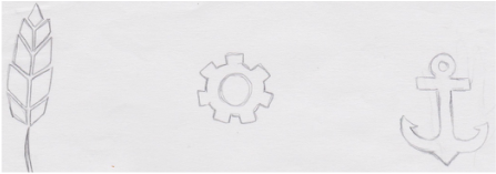
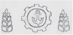
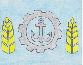
1. Keep it simple so a child could draw it from memory 2. Use meaningful symbolism 3. 2-3 basic colors 4. No lettering, seals, or words 5. Be distinctive or relative After researching Milwaukee's history I began looking up what symbols I could use to represent what I wanted to highlight about Milwaukee. I chose the gear to represent the industrial era, because gears play a large role in a machine operating properly. I chose the wheat symbol, because it not only clearly represents our wheat production, but also repents our beer production, of which we are famous for, hence, The Milwaukee Brewers. Lastly the anchor symbolizes the lake. After I practiced sketching my symbols I made thumb sketches to see what my flag would look like from far away. The most challenging part of designing my flag was choosing the colors. I could only use a few and I wanted them to mean something. The anchor and the gear were colored the same black color, making them appear to be a silhouette. I colored the wheat a gold-yellow, because it was the closest shade I had to the real thing in my pencil box. I chose the background to be a light blue specifically, because a lake is generally blue, but also to pay tribute to the original flag design. To finish up I drew my first design on a piece of printing paper for the MIAD representative to critique. |
|
Critique
|
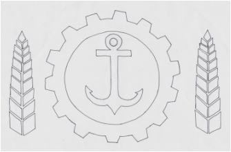
MIAD representative Phil Blair came and evaluated my piece. He suggest I try to combine both the anchor and the gear into one symbol. He also suggested that I curve the wheat stalks around the gear. These changes made the piece appear more fluid. To combine the gear and the anchor, I simply enlarged the anchor within the gear and erased where the two lines touched.
|

|
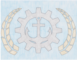
The second critique for my final exam brought to attention that the colors were too similar. He had said that he did not like outlines on any illustration that, that means there is not enough contrast. He also suggested that I adjust how much the illustration/symbols filled the flag. He said it would be impractical to hang and that the previous state of the flag made it feel very crowded. Using Photoshop I made the adjustments seen on the left, per his suggestions.
|
Reflection
This was one of the simplest pieces I created this year, which is why I believe I achieved my goal. The flag design is supposed to be simple enough for a child to recreate. However, it was difficult to decide which symbols and colors I wanted to use to show Milwaukee's past and present. Next time I would like to create my flag using something other than colored pencils, because I believe that it cheapened the look of my design. I would like to further explore the uses of Photoshop, or maybe even recreate my sketch with fabric so it looks like an actual flag. With what I learned through this assignment, I would like to be given some sort of business, or product and attempt to create a simplistic advertisement for it like Bernhard had done. I believe I created a flag that accurately represents Milwaukee's history as well as, Milwaukee's current state and I hope it will be flown for all to see.
